Average Rates

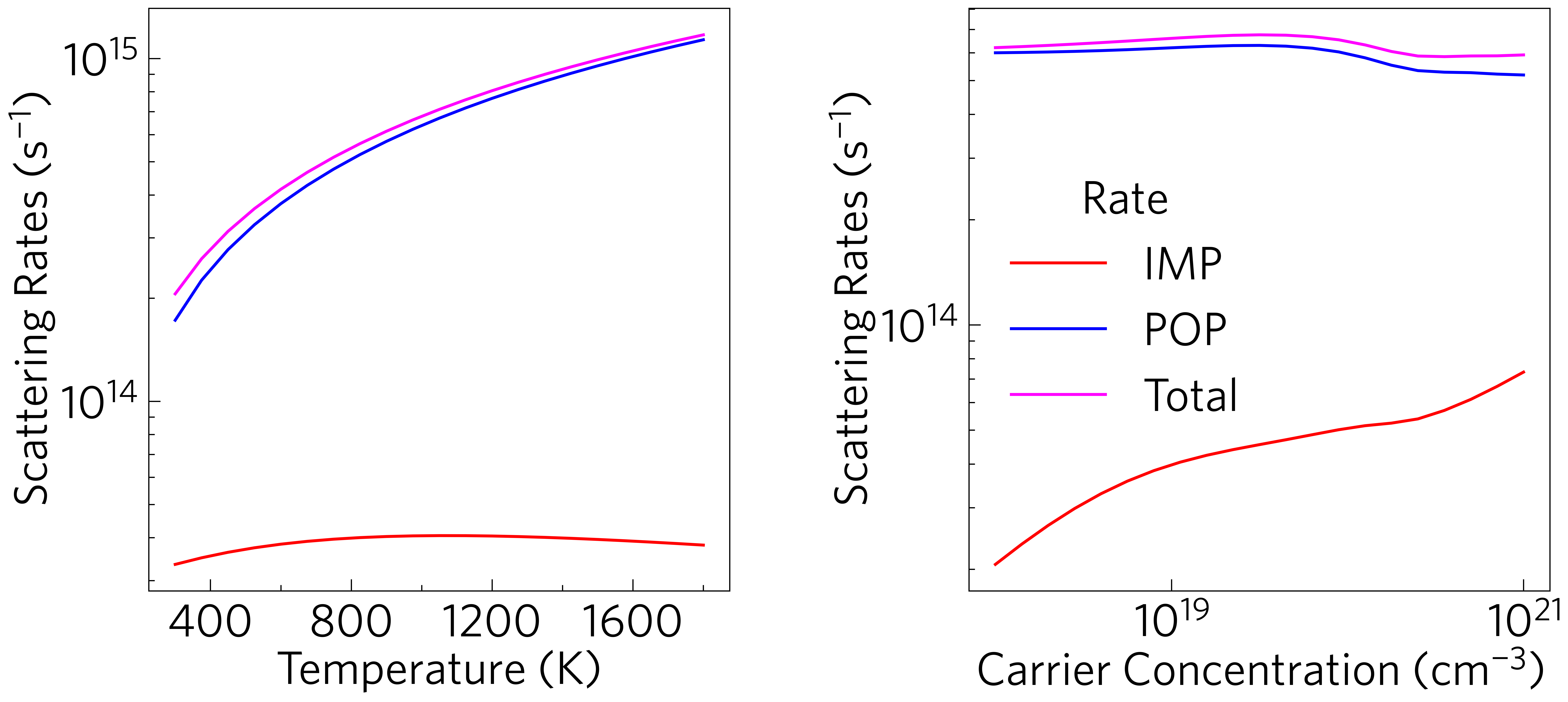
This shows the average scattering rates against temperature, averaged across k-points and weighted by the derivative of the Fermi-Dirac distribution, as they are when calculating the conductivity, thereby giving a representative image of the effect the scattering processes play in the material. This can be plotted at the command line with:
tp plot avg-rates ../data/basno3/mesh_75x75x75.h5 -t 1000 -n -1e19 --location 2 --large -c{red,blue,magenta}
If rates are included in the file but are very low, you may want to
--exclude them; --exclude PIE may be particularly popular.
While ThermoParser does not currently have python functions to plot
line graphs, it does calculate the weighted rates and the ancillary
functions should make this relatively straightforward:
1 2 3 4 5 6 7 8 9 10 11 12 13 14 15 16 17 18 19 20 21 22 23 24 25 26 27 28 29 30 31 32 33 34 35 36 37 38 39 40 41 42 43 44 45 46 | #!/usr/bin/env python3
import tp
import numpy as np
f = '../data/basno3/mesh_75x75x75.h5'
q = 'weighted_rates' # 'weighted_mfp' #
temperature = 1000
doping = 1e19
colour = {'IMP': 'red',
'POP': 'blue',
'Total': 'magenta'}
# Example only shenanegans
from os import path
if not path.isfile(f) or path.getsize(f) < 1024*1024*10:
raise Exception('File not found, please use get-data.sh in the folder above.')
# End of example only shenanegans
# Axes
fig, ax, add_legend = tp.axes.large.two_h()
# Load
data = tp.data.load.amset_mesh(f, q)
data['doping'] = np.abs(data['doping'])
tdata = tp.data.utilities.resolve(data, q, doping=doping)
ddata = tp.data.utilities.resolve(data, q, temperature=temperature)
# Add
for i, rate in enumerate(data['stype']):
ax[0].plot(tdata['temperature'], tdata[q][i], label=rate, color=colour[rate])
ax[1].plot(ddata['doping'], ddata[q][i], label=rate, color=colour[rate])
axlabels = tp.settings.large_labels()
for a in ax:
a.set_ylabel(axlabels[q])
ax[0].set_xlabel(axlabels['temperature'])
ax[1].set_xlabel(axlabels['doping'])
tp.plot.utilities.set_locators(ax[0], x='linear', y='log')
tp.plot.utilities.set_locators(ax[1], x='log', y='log')
add_legend(title='Rate', location=2)
# Save
fig.savefig('avg-rates.pdf')
fig.savefig('avg-rates.png')
|
The weighted rates can be calculated directly via the
tp.data.load.amset_mesh function, by specifying weighted_rates
as the quantity (lines 7, 24). Selecting which data to show is then
as simple as using the resolve function (lines 26/27). To plot the
graph matplotlib’s normal plot function is used, and the axes,
labels, ticks and legend are all sorted out by tp functions (lines 21,
34-38. 39/40 and 42 respectively, see also Tutorial-05).
This graph can instead show weighted mean free paths, by adding the
--mfp tag at the command line or changing q to equal
weighted_mfp in python.